Great new visualizations for time-series analyses and trackers
Crunch now has a completely redesigned time plot that offers confidence bands, smoothing, and custom selection of categories to show/hide.
Line graphs are great at showing how values are changing over time and therefore ideal for tracking studies. Crunch’s line graphs have been completely redesigned to offer some great new features as well as improved usability and flexibility.
Category selection
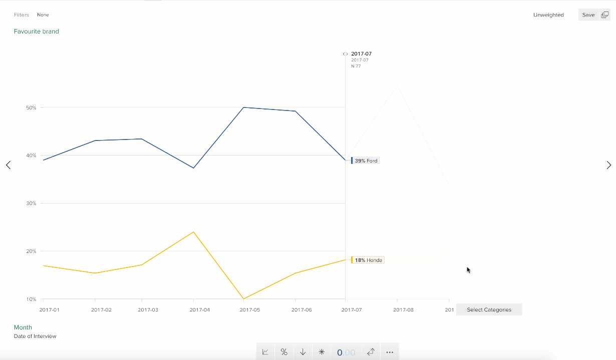
Line graphs become really hard to read when there are lots of lines shown simultaneously, so Crunch now defaults to showing just the top 5, but you can pick whichever combination of lines (including showing more or fewer than 5) from the new “Select categories” interface. This allows you to show just the lines that tell your chosen data story. And your selection is then reflected in PowerPoint exports and dashboards.
Confidence bands
Crunch’s line graphs now support the display of confidence bands, calculated at 95% confidence, and you can turn these on or off with the click of the * asterisk button.
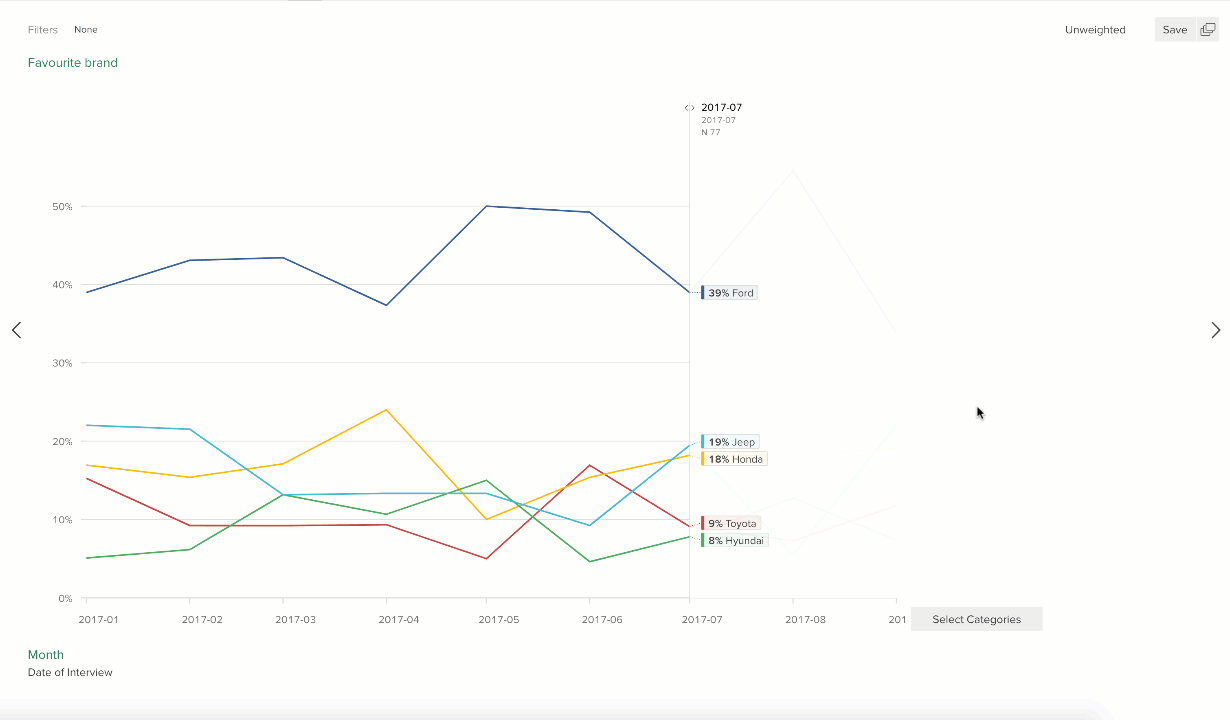
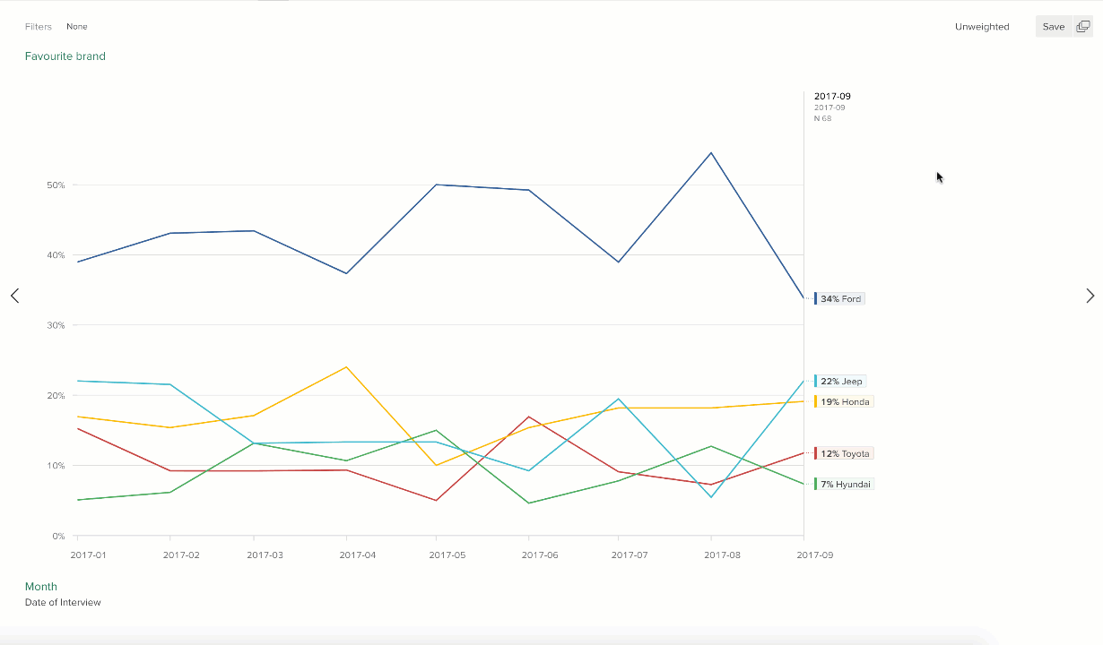
Draggable bar
As well as being able to hover over points to see their values, there’s a vertical bar that you can drag to any point in the time-series to see all the values and ranking at that point in time.
Smoothing
Smoothing, also known as “moving averages” or “rolling averages”, has been available for the existing line graph component for a little while, thanks to the new “Categorical date variables”, but works here too. Click here to read more about the new Smoothing feature.
Editable labels
Another advantage of using categorical variables with the new date attribute is that you now have control over the labels that are displayed for the x-axis. So if you want to call them something more meaningful to you (or your client) such as “Wave 17” or “Extra Christmas boost” then you can.
For full details of this new feature and where to find it, see the help center.
Crunch.io uses cookies to ensure you get the best experience on our site. By using this site, you agree to the use of cookies in accordance with our Cookie Policy.